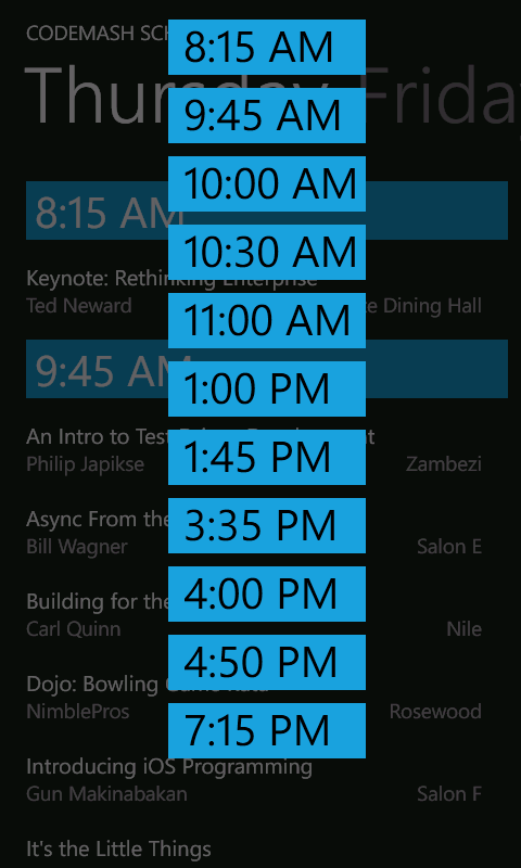
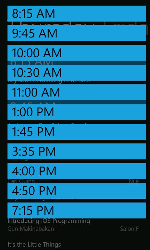
A fix for the WP7 Toolkit LongListSelector (aka JumpList)
I ran across this issue while trying to duplicate the functionality of a third party jumplist. I wasn’t necessarily trying to replace it but just trying to learn how to make the LongListSelector from the Windows Phone Toolkit behave the same way. Along the way I learned a little bit about how LongListSelector was put together. Reading someone else’s code is always a good thing.

I submitted a patch for this in January but the Windows Phone Toolkit project looks a little dead. That’s understandable given Windows Phone 8 and Jeff Wilcox’s move to the Windows Azure team. Since someone might be trying to use it in the interim I thought I’d post this fix.

The solution is to comment out the line
_itemsControl.HorizontalAlignment = HorizontalAlignment.Center;
in the BuildPopup method in LongListSelectorGroup.cs. This allows the Horizontal alignment property of the popup content to control how it is displayed.
With this change the LongListSelector behaves more like the third party controls that I have seen.
